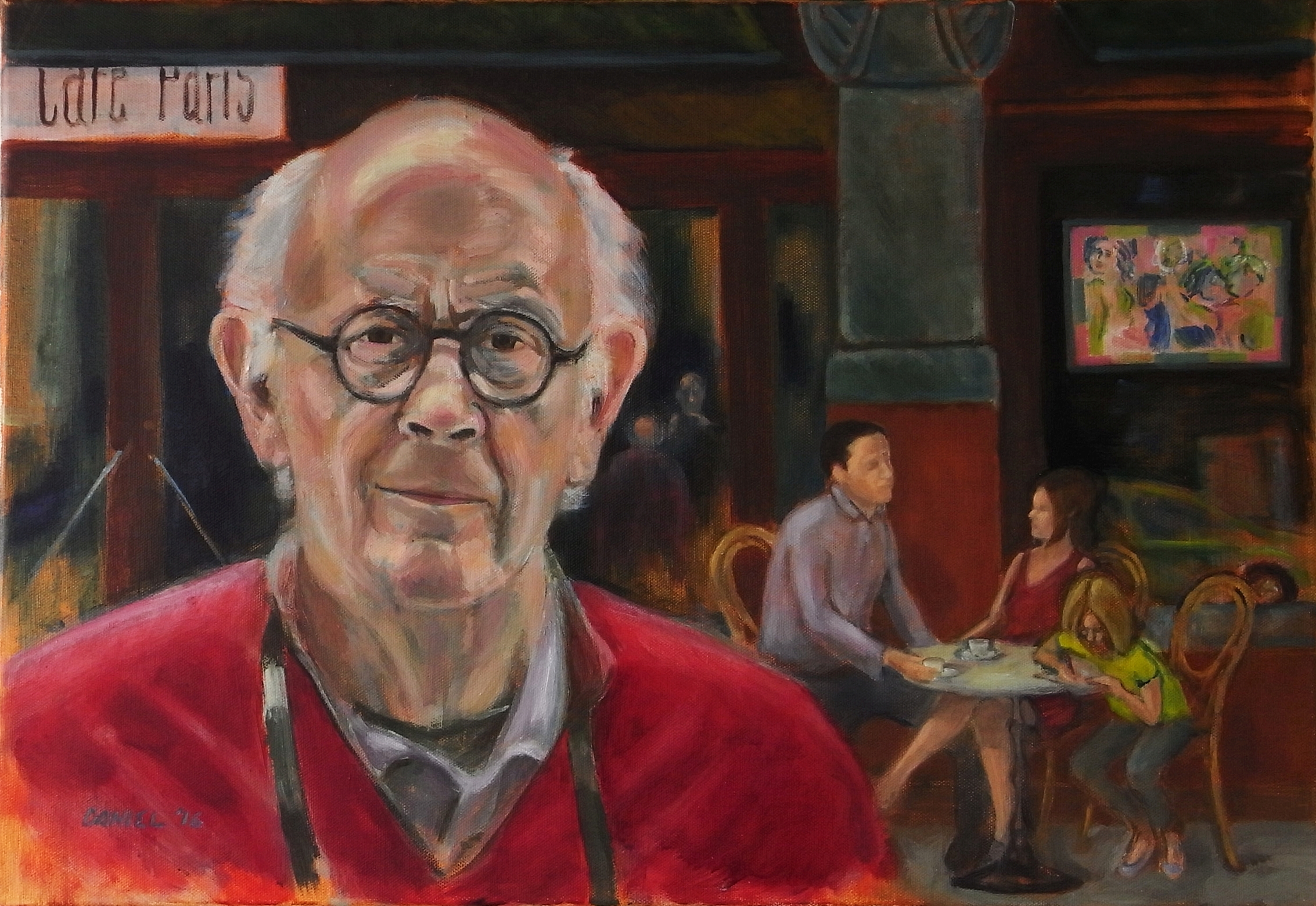

Stewart traveling 2016
This portrait was based on a photograph of my father, though I took some liberties, particularly with the background. Here is the photograph:

I started by making a sketch:

Then, I gave painted the canvas with a rather orangey mixture of burnt sienna and raw umber, and did a charcoal drawing on that.

Afterwards, I did an underpainting using terra verde.

Both of these choices caused me quite a bit of trouble as the work continued. The orange proved very dominant, and the green gave the skin a pale and pallid color.
Painting the shirt red seemed to help with the skin color, giving it some warm tones to relate to, and darkening setting helped subdue the orange. A lot of the rest of my time was spent moving the figures around in the background. My original aim had been to make them anonymous, but this proved intriguingly difficult. 
Shortly after this, I showed the painting to my friend Jiska, whose observations regarding the light on the figures led me to make some changes that helped unify the painting. In the end, I felt fairly satisfied with the painting. Although it felt somewhat limiting to work from a photo, I nonetheless felt that there were still plenty artistic choices left to make. I enjoyed designing a context for the figure and had a great time thinking about and trying to present the intricacies of my father’s expression.
That’s a wonderful painting of Stewart, and an excellent description of how you did it.
You were always a very good painter. I think now you are a great painter.
You’re looking more and more like your father, by the way. :-)