I made a few drawings last week that I liked. This is quite nice to be able to say, and it’s not something that I’ve ever found particularly easy. Self-criticism is important, and necessary for improvement, but if it goes unchecked, it can be awfully debilitating and destructive.
It seems that I am approaching a balance in this regard. I still see defects and deficiencies in my work, but I’m finding them easier to accept. When I look at these drawings for example, I know that there are things that could be better about them, but that is a problem with the drawings, and not a problem of mine. Given the array of circumstances, I did what I could, and part of what I did was quite nice. I’m glad that I’m getting to a point where I can take pleasure in the results of my efforts and don’t need to disparage them. How did that happen?
I don’t really have an answer. I can show you the pictures though, and tell you what I think about them.

 I like many of the same things in both of these drawings. The figures fit nicely on the page; there are different types of marks on the paper, varying from bold shadings to delicate lines, and there is a certain consistency in their use.
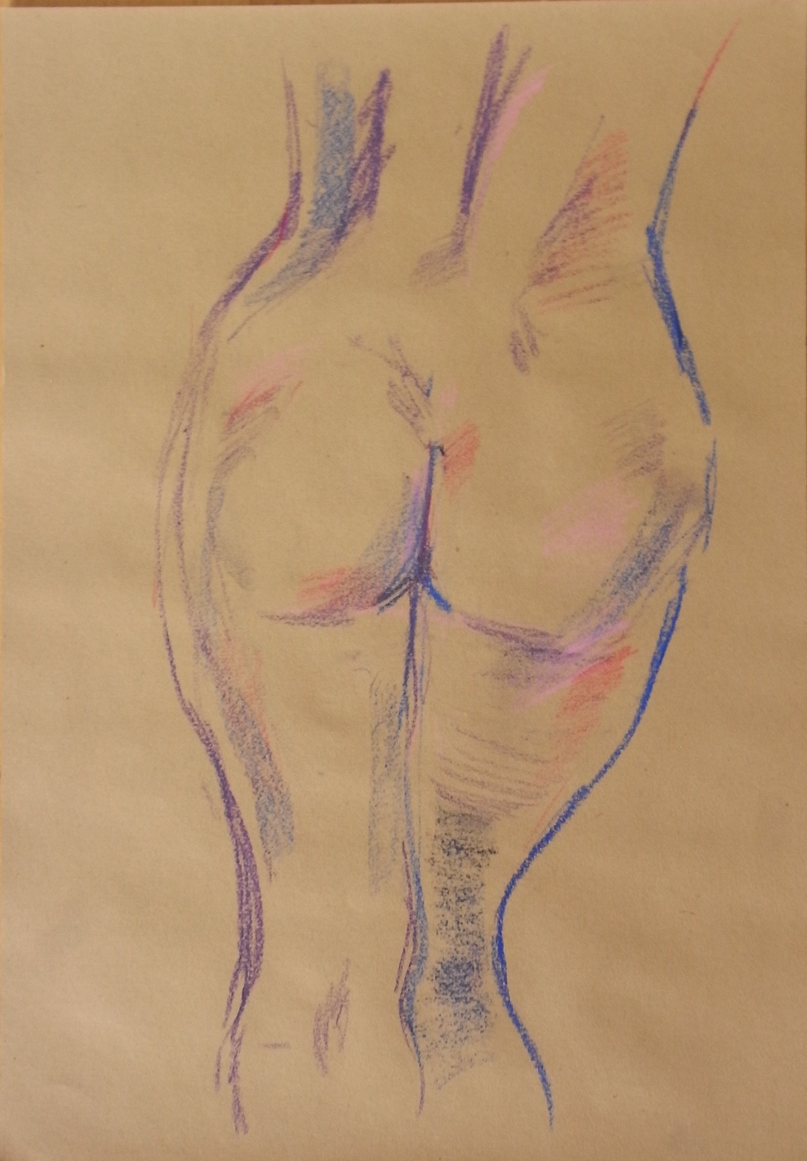
These next two drawings  I like for different reasons, but both having to do with the use of color. On the left, the green swaths indicate flesh in a simple, and for me visually pleasing way. The green pairs well with the red of the cloth. I like the way the legs fade out at the bottom, but unfortunately there is not enough room for something similar to happen at the top. I like it anyway. The drawing on the right uses color in an almost purely decorative fashion, with the possible exception of the pink. I also like the shape of th
 e body.
Artists don’t usually comment on their own work at all as that’s someone else’s job, and it is a bit awkward for me to be praising mine – but it’s good to be able to see beyond the defects and deficiencies.
Hello Daniel!
Being able to have a balance in self-criticism is a big step! it is important to be able to step away from your work and be “objective”… very difficult and necessary in order to grow. Yes, if one is too harsh a critic – it misses the point and one gets sidetracked in a lot of unproductive and “going nowhere” crap. great to see your drawings . is it possible to make the drawings larger? they are a little hard to see at the size you are showing. i agree that the positioning on the page is really good on the first two drawings. they look beautiful, and i would like a closer look….the second two drawings are interesting, right now the red (pink) color and green DO seem arbitrary/ not sure i like the colors, but feel open to the idea of arbitrariness. The second color drawing seems less arbitrary – the blues function as shadow, yellow color of the paper as neutral, purples as mid-tones and pinks as “fleshtones” , whaddya think?
Oh, love the story of your visit to the Chinese restaurant in Amsterdam!
Thanks for the comments! It took a while, but now you can click the images and see a bigger version.